Archive for the at the conference Category

charts and diagrams to impress your audience

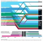
If you are hunting for best poster award or want to impress the audience with your presentation at a conference, graphs, charts and diagrams can be a key asset. In contrast to this, my experience from conferences has shown that presenters pay almost no attention how to communicate and visualise their research results. Therefore this post shall introduce you to some amazing but uncommon charts and diagrams and discuss some aspects to consider for creating amazing visual presentations.

Can amazing jpegmini help shrink large Powerpoint Presentations?

Just recently I came across an amazing new webservice to be found at http://jpegmini.com. You simply upload your jpeg images and can download them after a short time, having them shrinked by up to factor 8. For people running websites with large background images or your personal cloud storage this is amazing! Loadtimes are dropping considerably and you can stuff more images into the same webspace. This service helps you save money and time – and it’s all for free!

Ok, so far this is really useful. But how about shrinking bulky Powerpoint presentations? With some effort and creativity it is absolutely no problem to create a decent presentation of 30 slides weighing in a hefty 5-10 MB. And then your conference host asks you to upload your file onto the university’s server / send it him per email. Will a combination of JPEGmini and Powerpoint help?

To cut it short: No! Powerpoint simply doesn’t care about image sizes and resolution. We tested it with the following setup: took John Picken’s beautiful image from Lake Como from jpegmini website and embedded into a Powerpoint in full size (about 6 MB) and the optimised version (about 1 MB) at a resolution of 3705 x 2829. The result was two files with exactly the same size of about 600KB. After exporting the image out of the ppt, it was clear what happened: Powerpoint simply shrunk the image both times to 974 x 774 (99 KB)!

To conclude, JPEGmini wount help you reducing presentation file sizes. And! Powerpoint is not suitable for large screen presentations – so no HD or similar output!
Permalink | 1 Comment Link

Your research is amazing and your findings are ground-breaking? Then your presentation should emphasise your results by transporting your message in a sufficient and easy-to-follow manner. One way to achieve this, is to use beautiful typography for headlines.

These fonts are usually called ‚display fonts‘ and if you are not stuck in any kind of corporate design enforced by your institute / company, you should definitely check out a recent article at noupe.com featuring some amazing display fonts – and they are all for free: Free Fonts : A Walk on the Grunge Side

Although some might be to rugged, most of them would definitely go well on 1 or 2 slides stating your main message. Just imagine using for instance the font ‚Protest Paint‘ to shout out: „Global Warming is real!“ or „Stop Smoking now!“ and nothing more on one slide. Your audience will definitely remember you as having a clear and valuable statement!

My personal favourite is Wicked Grit, which will be in my next presentation.

What do you thing? Do you have the freedom to use your own presentation layout at conferences?

Kjell